CFO Dashboard: Essential Metrics, Examples, and Best Practices
- August 10, 2026
- OHI
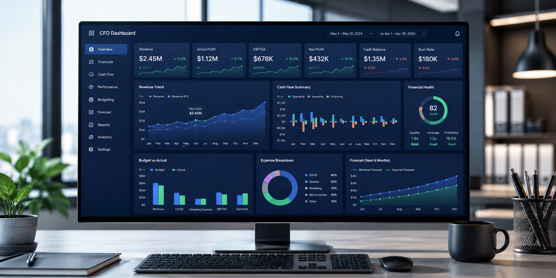
A CFO dashboard is a centralized visual display of a company’s most critical financial metrics. It pulls live data from accounting systems, ERPs, and operational tools. It presents that data in one place. The goal is simple: give financial leaders a real-time view of performance, risk, and cash position without having to dig through spreadsheets.
A CFO KPI dashboard is not the same as a standard financial report. Reports look backward. Dashboards show what is happening now, and flag what is about to become a problem.
According to a November 2024 Gartner survey of 251 CFOs, metrics, analytics, and reporting ranked as the top priority for finance leaders in 2025. More CFOs cited enterprise growth and insight delivery as priorities than at any point since 2014. A well-built accounting dashboard is the infrastructure that makes that possible.
Key Takeaways

Most CFOs manage two core responsibilities. First, financial decision-making. Second, financial reporting. Both require fast, accurate, current data.
Without a dashboard, that data lives in multiple systems. Finance teams pull it manually. Numbers arrive late. By the time the report is ready, the window to act has already passed.
A CFO dashboard solves this. It integrates data from your ERP, accounting software, payroll system, and operational tools. It calculates and displays key metrics automatically. It updates as new data flows in.
The result is a live view of your business, not a snapshot from last month.
The right CFO dashboard metrics depend on your industry and goals. But most dashboards share a core set of financial KPIs across five categories.
These tell you whether the business generates income efficiently.
These indicate whether the business can meet its near-term obligations.
These measure how well the business converts resources into results.
A well-built CFO dashboard sample has three properties. It is scannable in under 60 seconds. It separates headline metrics from drill-down detail. And it makes anomalies visible at a glance without requiring the viewer to do any calculations.
Here are three common accounting dashboard examples:
Executive summary dashboard: Designed for weekly leadership review. Shows revenue, net margin, cash position, DSO, and budget variance side by side. Each metric includes a trend line and a RAG status against target.
Cash flow dashboard: Focuses on liquidity. Tracks cash inflows and outflows, AR aging, AP due dates, and projected month-end cash position. Useful for businesses with tight cash cycles or high invoice volumes.
Operational finance dashboard: Breaks down performance by department, product line, or property. Compares actuals against budget at a granular level. Used by controllers and FP&A teams for deeper analysis.
The key difference between a useful dashboard and a cluttered one is prioritization. The best accounting dashboard examples show 8 to 12 metrics at the headline level. Drill-down access holds the supporting detail.
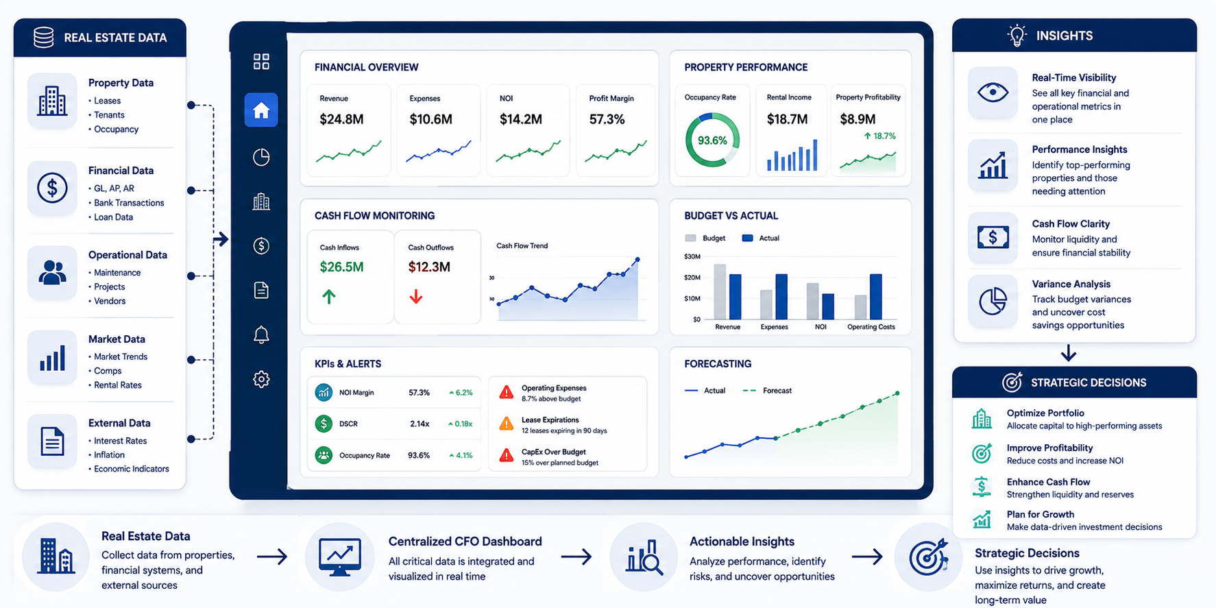
Real estate CFO dashboards add a layer of operational complexity that general finance dashboards do not cover. Property-level performance has to roll up to portfolio-level reporting. Metrics like occupancy, NOI, rent collection rate, and CAM variance matter as much as standard financial KPIs.
A San Francisco-based real estate investment and property management firm managing a $1.5 billion portfolio faced this challenge. Their data was spread across multiple sources in different formats. Consolidating it for portfolio-level analysis required significant manual effort.
OHI built a custom visualization solution using Power BI and Tableau. The team implemented an integrated data platform centralizing information from disparate sources. Customizable dashboards were designed for different stakeholders, including investors, property managers, and owners. Automated validation and scalable architecture ensured the solution could grow with the portfolio.
The results:
Read the full data visualization case study here
Building the dashboard is the easier part. Making it useful over time requires deliberate design decisions.
Track leading and lagging indicators together. DSO predicts cash flow problems ahead. Net margin reflects past performance. A CFO KPI dashboard needs both.
Set materiality thresholds for alerts. A 2% revenue variance may not need attention. A 15% one does. Build that rule in rather than relying on manual scanning.
Align the dashboard to the reporting cadence. KPMG’s 2025 cash flow leadership report highlights that proactive working capital management requires aligned metrics and transparent accountability. Refresh cash data daily, operational metrics weekly, strategy monthly.
Connect to primary accounting records. Under IRS Publication 334, accrual-basis businesses must recognize income and expenses in the period in which they are earned or incurred. Dashboards fed by cash-basis extracts will not reflect real financial position.
Keep it auditable. Every metric should trace back to a source record in seconds, not hours.
Separate dashboards by audience. A property manager needs different metrics than a limited partner. Build role-specific views rather than one universal dashboard that serves no one well.
OHI builds and maintains custom accounting dashboards for real estate firms, property managers, CPA firms, and businesses across the US, UK, Canada, and Australia.
Services cover the full pipeline, from accounting and general ledger support that feeds clean data into dashboards, to Power BI and Tableau dashboard development tailored to your reporting requirements. OHI integrates with Yardi, AppFolio, QuickBooks, NetSuite, and MRI.
Whether you need a real estate accounting dashboard or an investor-ready reporting package for a fund structure, OHI designs visualizations to match the decisions at each level of your organization. For CPA firms managing multiple clients, OHI builds standardized templates with consistent KPI definitions across every engagement.
Contact OHI to discuss a custom CFO dashboard built to your reporting structure and financial systems.
Core metrics include gross and net profit margin, current ratio, working capital, DSO, DPO, revenue growth rate, and budget vs actual variance. Real estate dashboards also include occupancy rate, NOI, rent collection rate, and CAM variance.
A management report is a static document produced at a set frequency. A CFO dashboard is live and updates as data changes. Reports look backward. Dashboards show the present and surface early warning signals.
Most effective dashboards show 8 to 12 metrics at the headline level. More than that makes it harder to identify what actually matters. Drill-down views can hold more detail, but the top level should be scannable in under a minute.
Yes. Many businesses outsource both the build and ongoing maintenance to specialists combining accounting knowledge with data visualization expertise. This is especially common for real estate firms, fund managers, and CPA firms needing consistent, audit-ready reporting across multiple entities.